After 30-days of one new corporate logo a day towards the big unveiling of what is now Yahoo’s new corporate brand mark since its founding 18 years ago, we couldn’t help but imagine that Yahoo under new CEO Marrisa Meyer, was now doing things in a different manner, the good kind of ‘different’ . Yahoo was listening, listening to people’s feedback before they made their decision. One after the other, a new logo different from the last was unveiled and implemented across the internet giant’s family of online properties for a 24-hour period each – people where excited and valuable feedback kept pouring in, we all felt like we were there with Yahoo making an important decision to forge the future of the Yahoo brand. Google, not even in all its doodling glory has ever embarked on such an exercise at this scale. Yet here was Yahoo, now led by an ex-Google Exec, sticking it in Google’s face. I could picture it already, somewhere inside Yahoo’s headquarters, in a purple room, engineers, designers and statisticians happily gathering the user-feedback that each new logo received and cleverly building it into logo number-30, the big one, which would emerge as a user-inspired corporate brand that everyone would at least respect if they did not like.
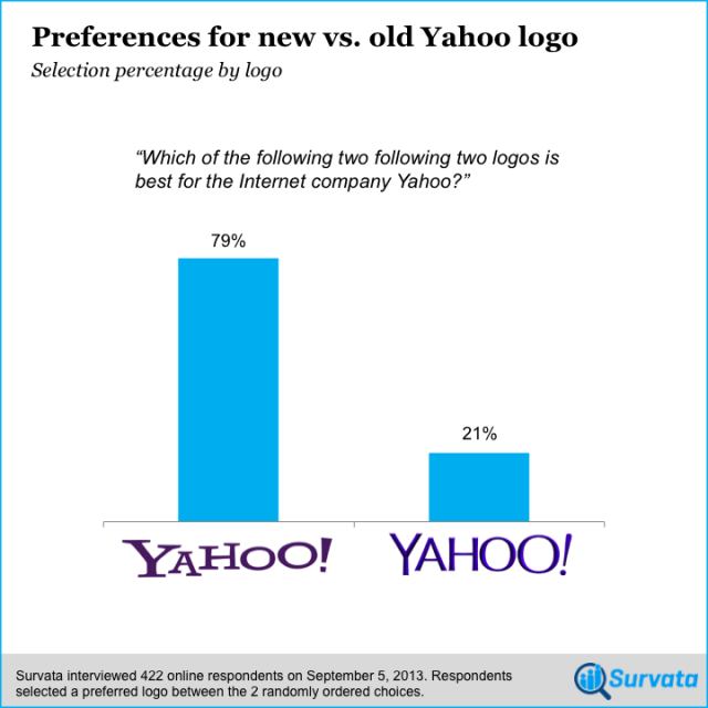
When the new logo was finally unveiled all the happy thoughts went away as we discovered with shock, the abomination of a brand that Yahoo hurled at us. It’s not that it’s ugly as much as it is that it ‘s bland and wasn’t the best of the 30 logos they showed us, it didn’t appear to be a combination of the 29 other logos either, and nobody seems to like it, in fact, while it looks a bit like the old one, it’s not better than that too. Its just, well… meh! More than three quarters of Internet users prefer Yahoo’s old logo to the new logo, according to a survey of more than 400 online respondents from market research group Survata,
Soon afterwards it all became clear why Yahoo’s new logo turned out so regrettable. As usually the case, I was expecting an eccentric designer with an exotic name, a Swedish accent and endless credentials to come out of Yahoo and rationalize the sentient essence of the new logo as well as telling us about “zee” 8 months spent in isolation developing “just zee perfect angles and tones” for the new brand mark in a way (and an accent) that would at least make this whole mess sound more interesting. Instead, it was the CEO, Meyer who attempted to rationalize the process on her Tumblr blog:
“On a personal level, I love brands, logos, color, design, and, most of all, Adobe Illustrator. I think it’s one of the most incredible software packages ever made. I’m not a pro, but I know enough to be dangerous”
It gets better, The Adobe Illustrator-loving CEO goes on to say:
“So, one weekend this summer, I rolled up my sleeves and dove into the trenches with our logo design team: Bob Stohrer, Marc DeBartolomeis, Russ Khaydarov, and our intern Max Ma. We spent the majority of Saturday and Sunday designing the logo from start to finish, and we had a ton of fun weighing every minute detail.”
Of the 30 logos, it’s the one the CEO designed over a weekend that won; the one person out of Yahoo that nobody can say no to. How about that? it turns out the other 29 logos had no chance the whole time. This is what happens when a CEO believes she is the most brilliant person in a room full of professionals. What certainly reels me up is the fact that a self-titled hobbyist Adobe illustrator user who happens to be the CEO would take the entire re-branding process of a company at the verge of fading away at ransom for “a ton of fun” and then force the results down the throats of everyone else. What qualified and trained design professionals at Yahoo had to say or what the users were expecting didn’t matter at all? The results are plain to see, Yahoo has come out with a fugly logo the 90’s would be proud of and nobody in Yahoo will dare question or criticize aloud. This marks a significant and unnecessary step towards Yahoo’s eventual demise. Meanwhile, the rejected design ideas and concepts that design intern, Max Ma may have been working on while also working ‘with’ Mayer on the new logo have surfaced on his personal website, they have since been taken down:

I bet there are Zimbabwean Founders, CEOs and Managers that will read this post and quietly curse and mock Merissa Mayer for this blunder. How could she? Lo and Behold, they’ themselves are amongst the worst. Working with a lot of Zimbabwe’s current crop of local Founders, CEOs and managers is allegedly one of the worst experiences a designer may endure in their career. While I disagree to the most extent, this is at least, what the overwhelming majority of local designers I have talked to are saying. Founding or managing a successful company takes brilliance, a fair share of luck, an incredible team and an environment skewed in your favor. It’s the first one, “brilliance”, that most local founders seem to associate with the success of their companies the most; their own personal brilliance, that is. And boy do they take this perceived brilliance EVERYWHERE they go, board rooms, public gatherings, other people’s work places, weddings, picnics and under their pillow when they sleep, smug in the knowledge that they are the most brilliant person in the room.

While this is what drives a lot of these very successful people through seemingly impossible barriers that the rest of us find impossible to face, It often results in huge egos. Unfortunately, huge egos don’t work well with branding and PR exercises. It doesn’t matter if your name takes up the first half of the company’s trademark or if you designed the first company logo on the back of a receipt back when no one else believed in you. The reality is that your success now has a lot more to do with the skilled talented people that deal with your customers on your behalf daily, but more importantly, it’s the customers they deal with that you owe a great deal of loyalty to, not vise versa. The new logo and the PR is for them to like and be proud of. So when re-branding opportunities come along, Founders, CEOs, Managers, their brilliance and their egos best stay away and let the skilled talented people whom they have employed and who are trained to do what they do best worry about the PR and the new logo. I’m just saying.


8 comments
yawwwn. slow news day huh?
Dude, hatisi kuTechcruch. I actually found it worth reading,
Yahoo’s almost pointless existence continues. Certainly prefer the old logo
She’s the hottest…!
Oops. Meant to say I dont really like the new logo. I thought the old one was timeless and unique. But whatever it is, the one Max Ma is hideous. Thank goodness they didnt choose that one
*the one by Max Ma
Its from an intern!
Hideous regardless. Being an intern doesnt imply bad designer. Even experienced people get their designs shot down.
Well said then. In as much as the logo is poor but I really feel its better than the old one! And on top of that I dnt really believe that she won as she claimed but she as a 38 year old just wanted to introduce the logo is a funny way which most of us ddnt appreciate!