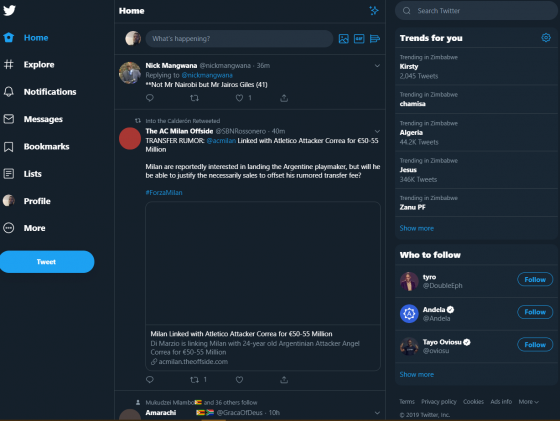
If you use Twitter for Desktop (why would you???) you may have noticed a new refreshed design that was rolled out earlier this week. If you haven’t, the redesign looks like this:
Apart from a refreshed design what else has been added and does this make the desktop site better to use?
Well, first of the desktop site now has an Explore page which makes it easier to find live video and local moments based on your location. I don’t care much for the Explore tab so I don’t think that will revolutionise the desktop experience for me all of a sudden.
Bookmarks are now accessible from the desktop, which for me is a big deal. Sometimes I bookmark a tweet as a potential story so coming back to it will now be much easier instead of having to like the Tweet so I can access it on desktop.
Lists, Messages and Profile now require fewer clicks to get to. It was irritating having to click on your picture and then select Profile from the old design, so this too is a welcome change.
Switching between accounts on Desktop is now almost as easy as switching between accounts on the mobile app, which is always a good thing.
There are now two options for dark mode; dim and lights out. Lights out ditched the navy blue tint for a true black. Interestingly this feature has come to desktop before coming to Android. It’s already there on iOS.
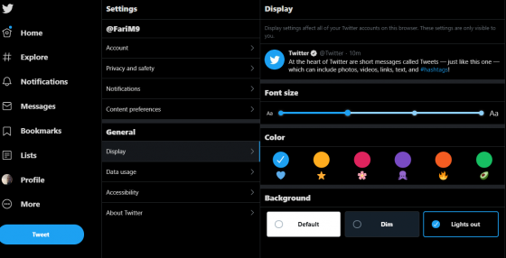
There’s also an option to add some different colours, like this:
Twitter says this version was rebuilt from scratch which is why it’s one of the more extensive changes in how the social media application looks on the desktop.
Have you discovered some things we have missed? And more importantly, is this better than the old layout?