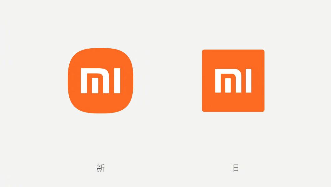
Chinese smartphone manufacturer Xiaomi has gone through a rebranding exercise. The company debuted a new Logo and font when it announced that it will be pouring in US$1.5 billion into an electric car division. Now I don’t know about you but the new logo isn’t that different from the old one. The designers seem to have just rounded off the edges on the old design and according to reports, this new logo cost Xiaomi US$300K.
The design for the new logo was done by Japanese graphic designer Kenya Hara and there is a video spanning 20 minutes where he describes the inspiration and meaning of the new design.
To my untrained eye, it looks like Hara (as mentioned before) just rounded off the edges. However, there was some mathematics in the form of the superellipse equation that went on to arrive at the new Xiaomi logo design. Kenya Hara and his team were trying to find the right balance between the old square design and a round shape and they opted for shape n:3.
So is it worth US$300K to very minutely changing a logo? To be honest I don’t know but we have seen subtle changes like these from big tech companies in the past. Microsoft for example flattened its original design and Google’s has been getting less complex than when the company started.
Lord knows how much they were charged for those subtle changes. In terms of price, we have seen some really expensive logo designs in the past. For example, the 2012 London Olympics logo cost US$625 000. Granted that was a design from the ground up not remodelling, but that is still pretty expensive.


What’s your take? Cancel reply