
I have with me a Microsoft Lumia 640 XL. Yes, it has seen better days but regardless this has to be the most user-friendly smartphone OS to ever be created. Better than anything during its time. Dare I say, still better than current offerings and this is why.
Runs smoothly on any hardware
Windows Mobile was undoubtedly the most efficient OS on the market. Efficiency being it ran very smoothly on even the most inferior of hardware. Phones with less than 1GB of RAM and a dual-core CPU still put out smooth animations.
Because it was so light it made it compatible with quite a range of devices with varying hardware specs from these 1GB RAM budget phones to the top-of-the-line 3GB RAM flagships in the Lumia 950s. Also isn’t it crazy that just 7 years ago flagships had 3GB of RAM and yet now the standard is 8.
But this aspect of the Windows Phone did something pretty interesting. It made the experience of every Windows phone the same. For day-to-day use, you could not tell between a 180-dollar phone and a 650-dollar one. They all worked in a very similar looking and feeling manner. And that was the Windows Phone experience.
User friendly
It didn’t end there. The windows phone collected heaps of style points when it came to the design of its UI. They arranged menus and buttons in an entirely different way from what Android and iOS did. A fresh new take on user experience.
Of course, we had live tiles that gave a glimpse of information from certain apps. And these were also quite customizable in how you could move them around and resize them. They looked cool.
The whole list of apps was a swipe to the left and you would just scroll down to find the app you need or search for the app in the search box right at the top. The physics when live tiles are animating or when scrolling again was just a fluid and pleasurable experience. Remember this here is a phone with 1GB of RAM and a bottom-tier Snapdragon 400 CPU but look!
The UI focused on reachability and so if you needed a button for something it was placed at the bottom close to your thumb. You can see this in the browser where the search bar and tab switching buttons are on the bottom, same with calendar options like adding a new event and even the menu options in the photos app. All the necessary buttons are placed at the bottom where they are easy to reach without any hand gymnastics.
The messaging app is the highlight for me and I think every messaging app must really consider this design choice. When you enter a chat you get a column on the right of the screen with thumbnails of all your chats. The genius in this is you could with just one tap jump into a different chat rather than a tap to hide the keyboard, another to exit the current chat, and a third to enter a different one. Honestly, this is very brilliant thinking and design.
Something that a few people including me noticed is how nice the Microsoft keyboard was to use. It did and probably still does a better job at making you type with the least amount of typos. And this is before autocorrect kicks in. Just accurately detecting the letter you clicked on.
It was desirable. A different take from what Android and iOS were offering at the time. Something fresh and unique and for a new player in the mobile OS market they had hit hard. Windows phone was cool.
So why did it die?
If the Windows Phone was this great new mobile operating system then why did it die such a rapid death? We can look at the early days of Windows Phone 8 and Zune, which was essentially the iTunes of Windows Phone.
Windows phone was trying an ecosystem-style of approach to managing files on windows phone. Something that may have had some traction if the Windows Phone was marketed as a premium product.
With how music is a fundamental part of the smartphone experience, Zune added a very complicated step towards making music portable; this made Windows Phone difficult to use and tough to recommend in its earliest days. Zune was eventually killed off with the introduction of Windows Phone 10 but some confidence points had already been lost there.
And like the iPhone, the early versions of Windows Phone had no bluetooth file sharing. Bluetooth was only available for connecting to bluetooth accessories like wireless headphones and that’s it.
But the biggest nail in the coffin was apps and the expectation of more from the biggest software company in the world. There was a big assumption from a majority of the population that since the phone ran Windows it meant that all the apps I can run on my Windows computer can work on Windows Phone. And Windows has plenty of executables available for PCs
As a result, a majority of people bought Windows phones thinking it’s a Windows computer that can fit in their pockets. Which it definitely was not. Of course, you had popular Microsoft apps preloaded on the smartphones but that was as far as windows pc apps went on Windows Phone.
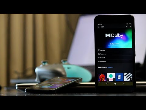
And then, on top of that big disappointment, we started seeing that a majority of the apps on iOS and Android were nowhere to be seen as well. And so without good app support, the Windows phone became undesirable, compounded by the fact that app developers were not able to bring these more popular apps fast enough to the Microsoft store.
So in the end Windows phone failed to excel at being the pocket-friendly computer that it was thought to be as well as being a competent alternative to iOS and Android. A case of amazing execution of the UI but a terrible experience just from a lack of app support.
I have to say I did and still do appreciate the work Microsoft put into the Windows Phone software. It’s an absolute joy to use both in aesthetics and function. It was so good I remember downloading a Windows Phone skin for my Symbian-based Nokia 603 back in the day. A testament to how much I appreciated the work put into the Windows Phone UI.
Did you own a Windows Phone? If so, what did you love about it and why did you end up leaving it?
What’s your take?